Sound Transit wants grow and with the communities and people it serves. Community is essential to the well-being of a growing city. As a reliable and stress-free option independent of traffic, they aim to be the link between the different communities that they serve. At the end of the day, they’re just people supporting people. They want to be the helping hand our communities deserve.
Concept
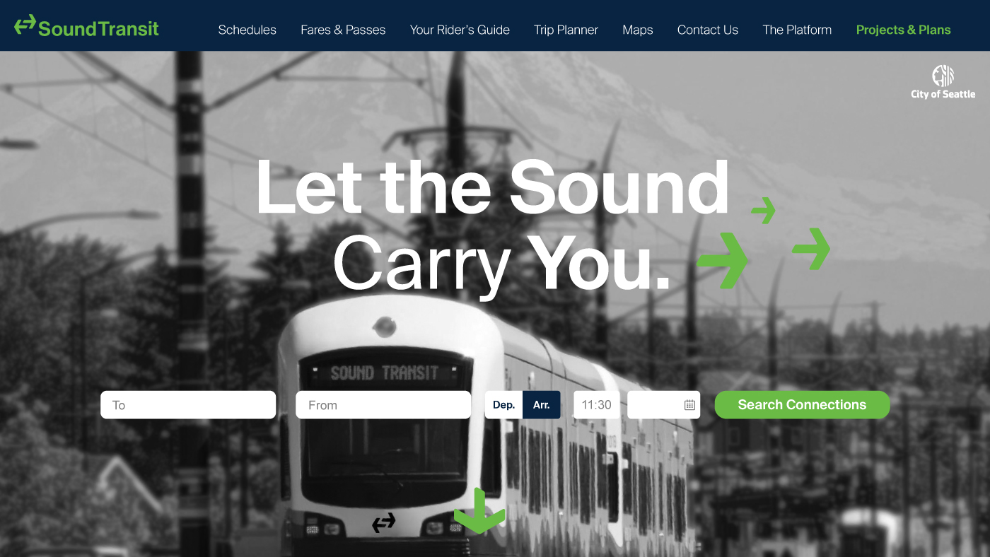
The brand concept intends to make public transit in the Seattle Metro area a universally accessible transportation service for our wide range of daily commuters and global visitors. Our rebrand of the Sound Transit relies heavily on our modular graphic systems, which could function as the primary means of visual communication in any city.
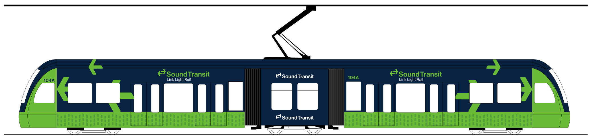
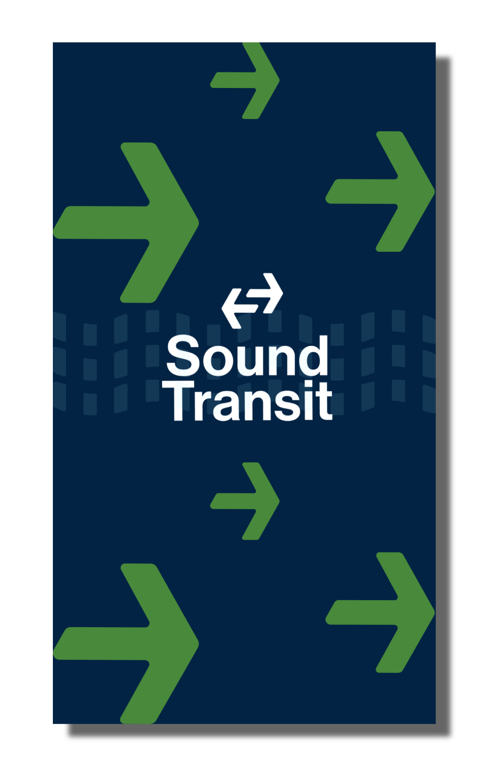
The logo is central to the graphic system of Sound Transit’s identity and concept. The utilization of arrows visually communicate the movement and dependability Sound Transit provides while passing through the Puget Sound. We drew inspiration from branding and graphic system of global transit providers which focused on users and functionality such as Seoul, Madrid, and New York. After many iterations, we coalesced all the best attributes of our different concepts and created this logo. The logo is composed of the two arrows facing in opposite directions. The spatial relationship between both arrows creates a letter “S” shape in the negative space to represent the Sound.

Along with logo mark, we created a modified version of the typeface Neue Haas Grotesk. The old Sound Transit branding used Akzidenz Grotesk, so we used the Neue Haas Grotesk type family as a way to give the logo an update.


in Neue Haas Grotesk Medium

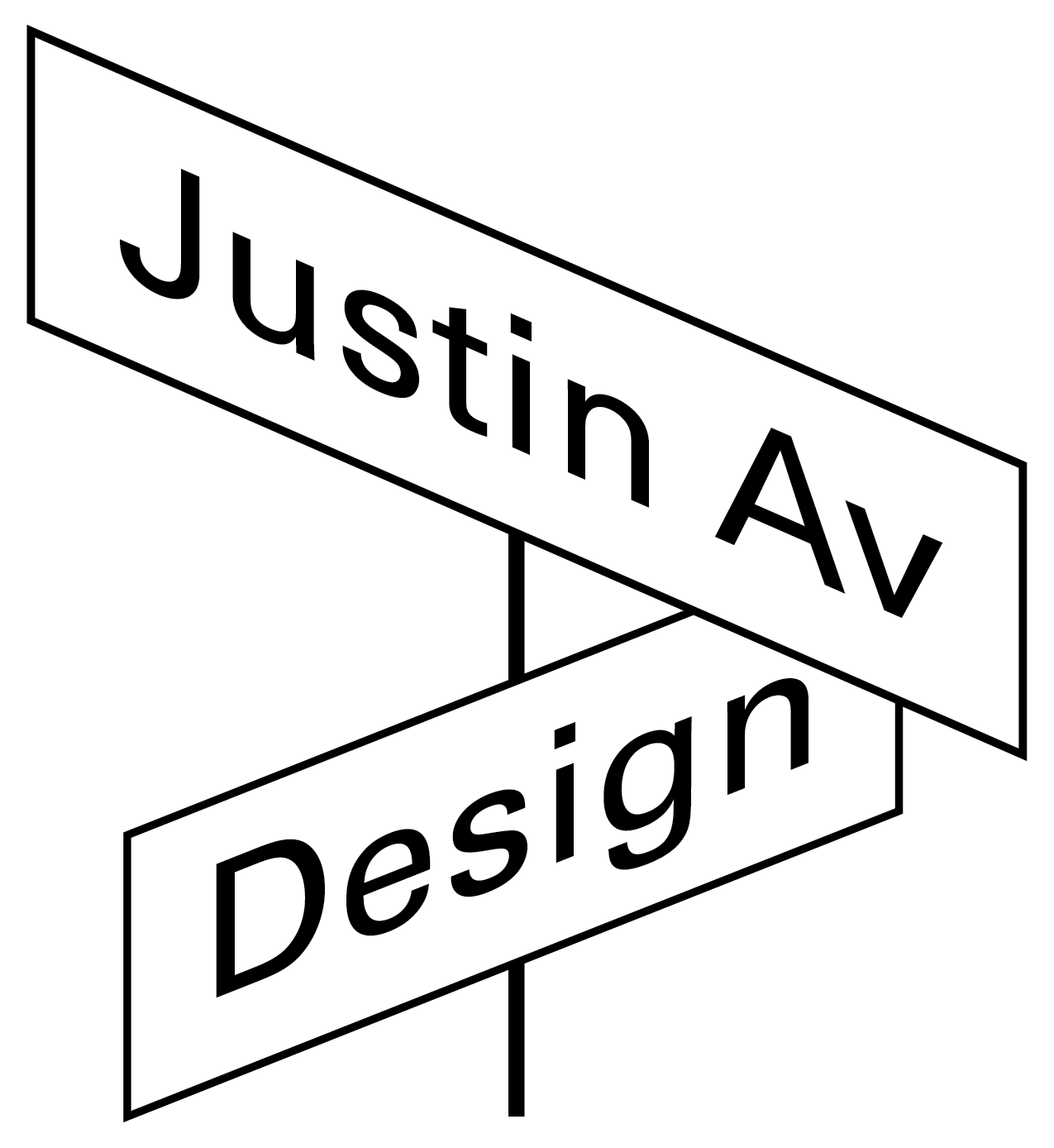
Horizontal Lockup

Vertical Lockup

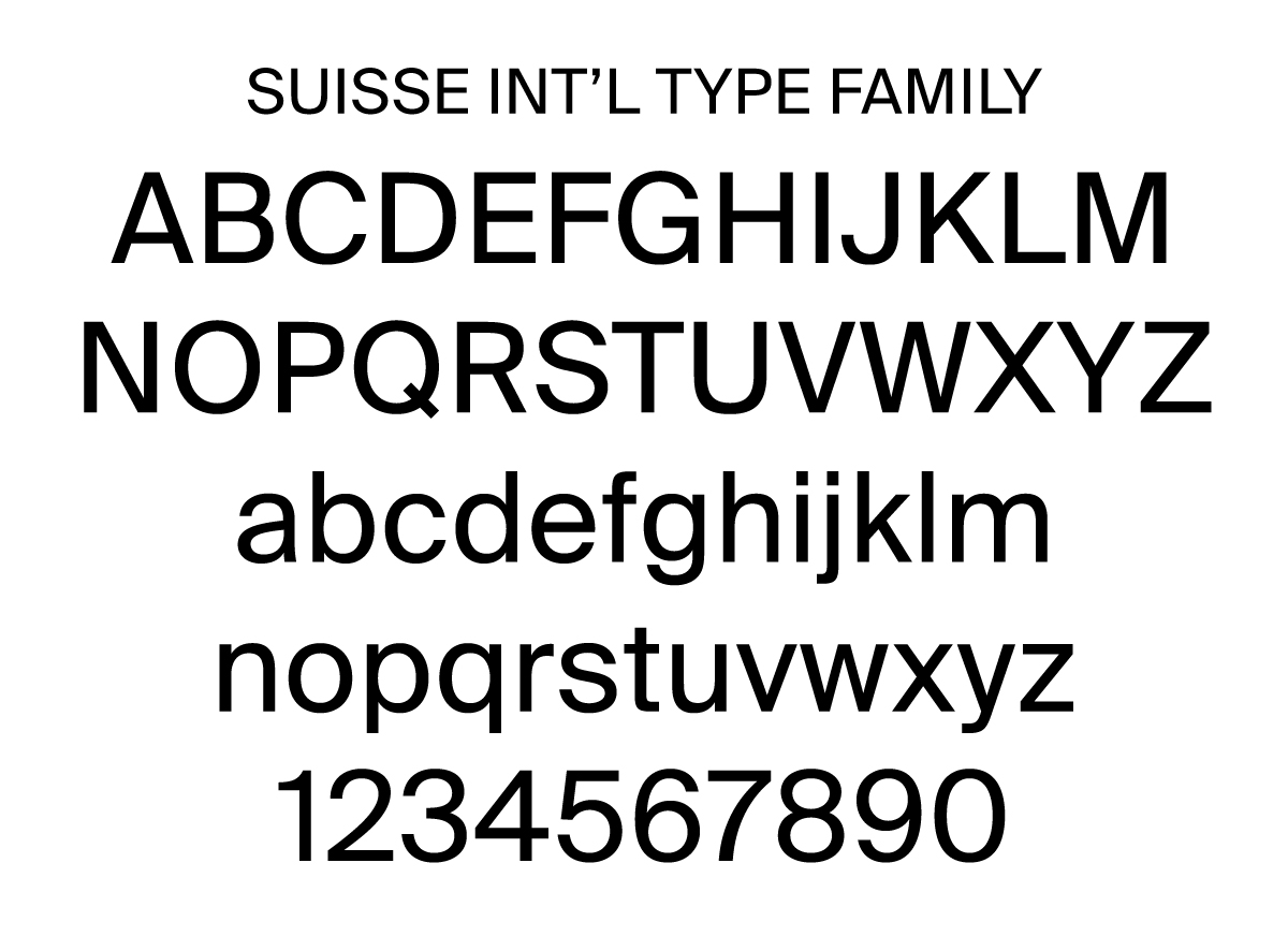
Suisse Int’l is the primary typeface because it is a versatile member of an impressive superfamily with many styles, including condensed, monospaced, humanist and serif versions that work together in an unabridged harmony. The Suisse Int'l type family is legible from all distances for wayfinding and contains personable traits.
Logo with different transit entities

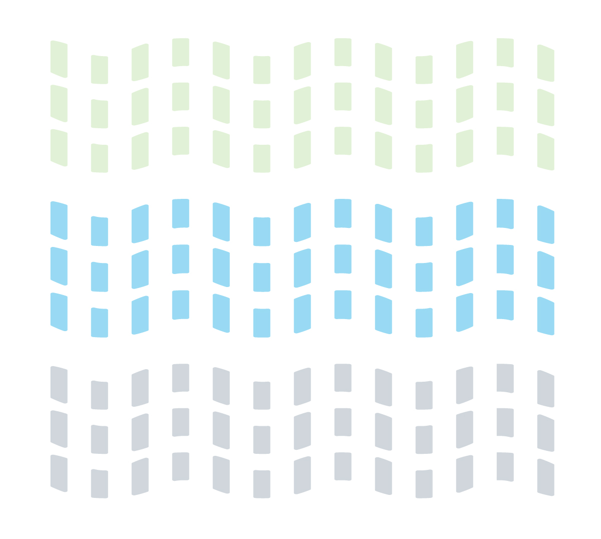
The secondary graphic element is a wave made of three rows of segmented bars. The secondary element appears in various applications of the brand identity and is used as a supporting feature. The flag-like wave is both a nod to the natural setting of the Puget Sound, and is symboilc of the diverse flow of commuters using the Sound Transit to navigate through their lives.
Secondary graphic element
The tertiary graphic element is an arrow which is primarily used in wayfinding. The singular arrow emphasizes stability, while the rounded corners offer a more accessible aesthetic.
Tertiary graphic element

Colors
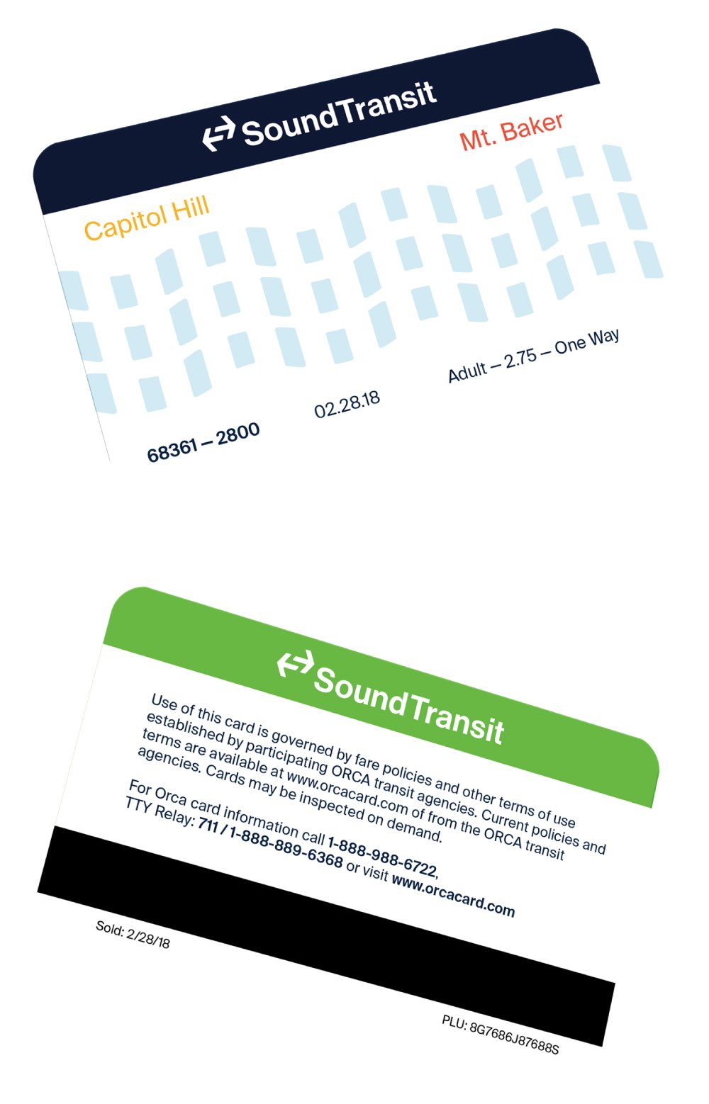
The primary colors are dark blue and bright green - Seahawks colors which give the universal graphic system an immediate cultural context of the city. The accent colors offer a directional indication in wayfinding in which the user can rely on where orange signifies South and gold signifies North.

Orca Card & Ticket Transfer

Uniforms


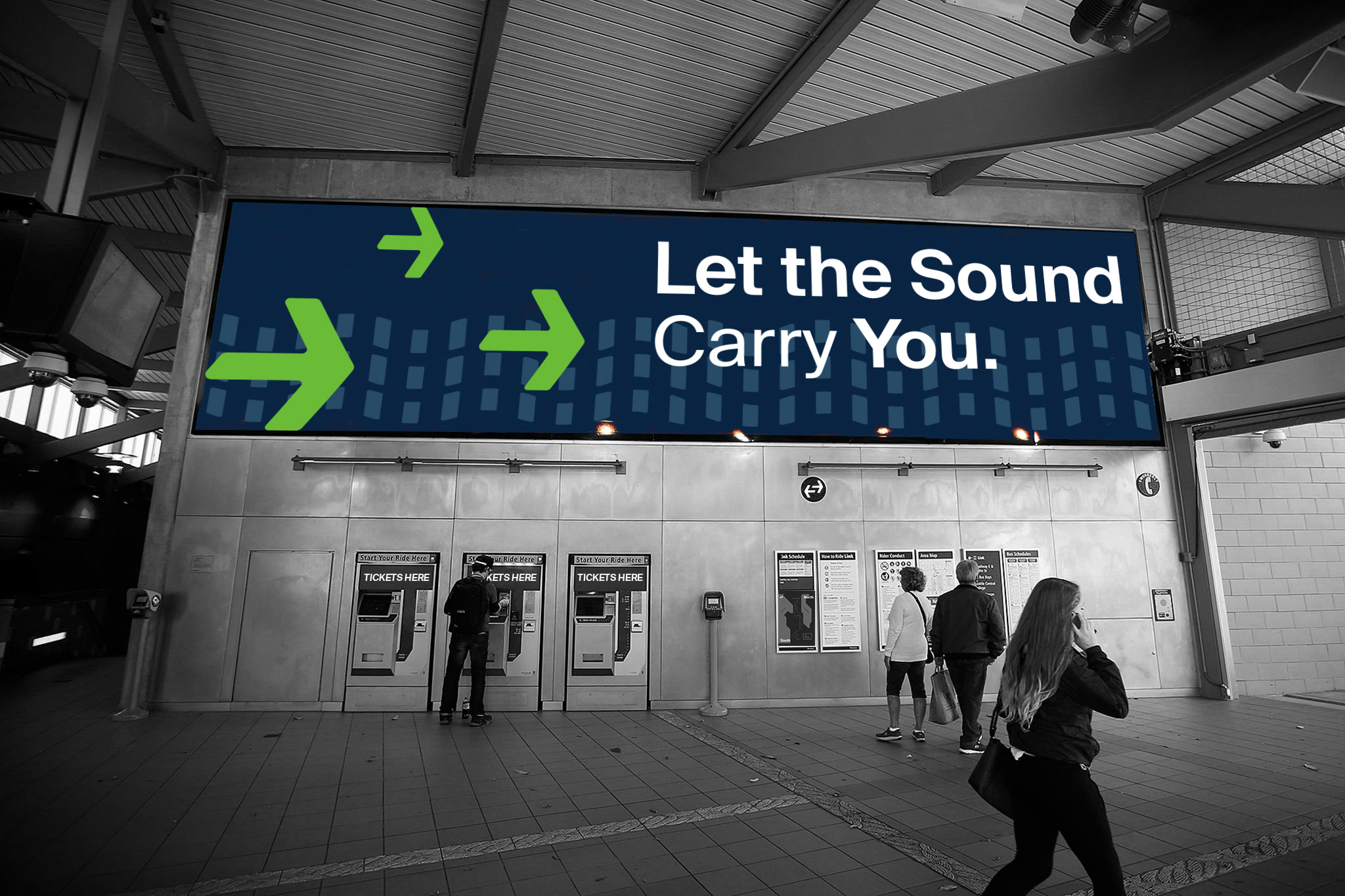
Advertising


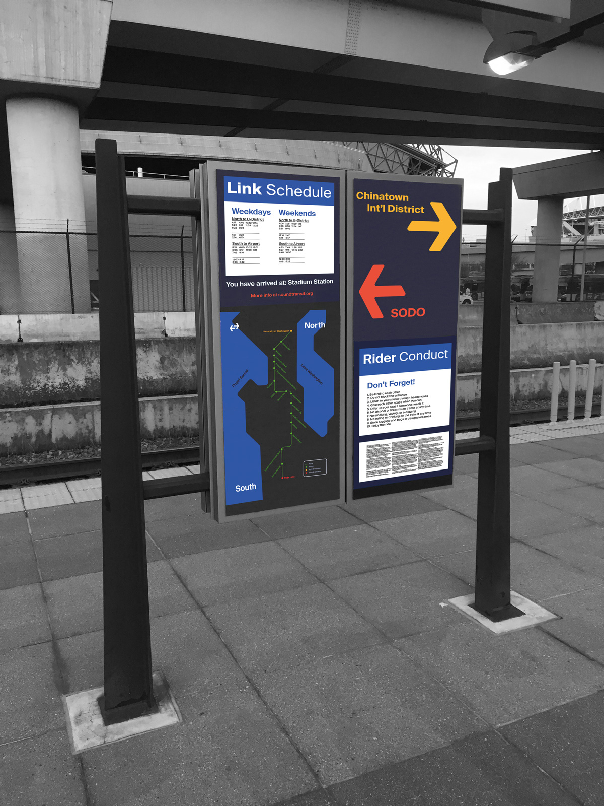
The Sound Transit poster series promoted their family of services. Each showing off the proud, reliable nature of the brand. The different graphic elements are used in both environmental wayfinding and promotional materials to create a cohesive look for Sound Transit.
Station Entrance Signage


Light Rail Station Marker Signage


Current Station Signage
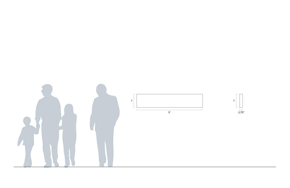

Light Rail Directory & Map Signage

Capitol Hill Entrance Mural


Credits
Partner: Scott Sanders