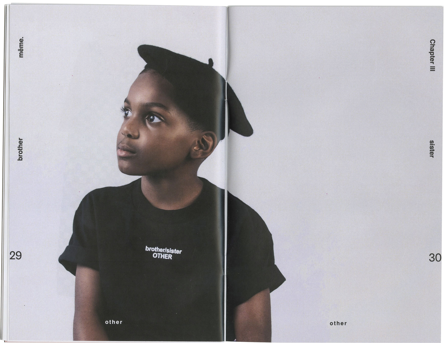
même Kidswear recently completed their 3rd collection, titled “Chapter 3: I am Other.” même is a kids clothing brand thats philosophy is “In a world of pinks and blues. It was born out of the idea that children’s products should be shared between brothers and sisters.
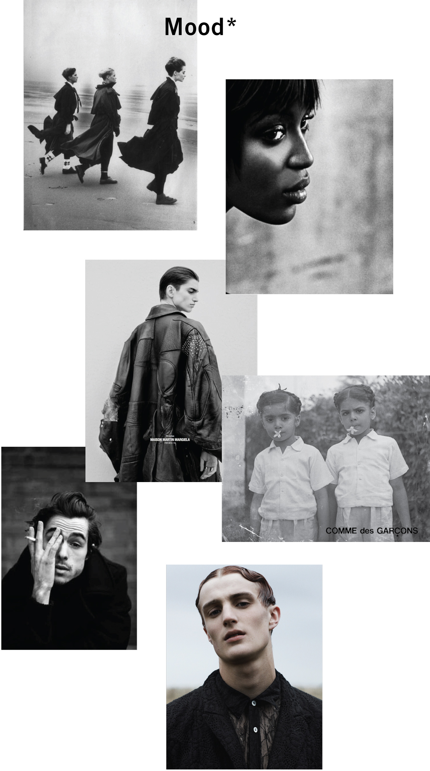
For the lookbook design, I drew inspiration from global fashion houses with a tendancy towards intellectual aesthetics. I utilized cropping to create a sense of intimacy in the design and embraced the natural and sometimes akward movements and poses of unencumbered youth.
The type family Trade Gothic is in keeping with the existing brand identity. I used a gentle serif typeface in the Tiempos family to create the feeling of storytelling of children's books, and it pairs well with the bold nature of Trade Gothic no 2.


Layout
The primary design objective was to create an extremely legible type system that would be equally accessible for adults or children that still conveyed a sense of minimal expression. The page number placement is for easily thumbing through the lookbook and includes the brand and collection name on every page. The layout showcases the clothing by being mindful of spacial relationships.


Credits
Founder of même: Reina Acab
Model: Eze
Stylist & Art Direction: Justin Av & Reina Acab
Layout Design: Justin Av
Photographer: Jared Santos